
I’ve often said that if people can’t find you they can’t do business with you and the corollary to that is that if they can’t read (or understand) what you send them they can’t be tempted to do business with you either.
One of the ways of almost guaranteeing that people don’t read your email message (or read your web site for that matter) is when you choose to use a light font colour, a poor contrast back ground colour or a small font. Whilst any one of these is a sin, the combination of several of them is diabolical and almost instantly causes readers to hit the delete key.
The email below shows how it can ensure that your message doesn’t get read. Yes, and I know I can hit the link to read it in the browser, but why make it hard for me… remember getting and keeping their attention is the rule number 1. And in this case the readability on the browser is just as bad!
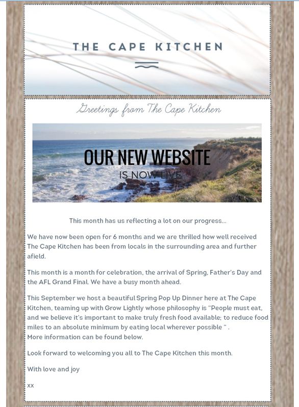

And I know it may be just the way the screen settings on my device may be but if I can’t read it there’ll be many others who can’t as well. So why risk it… always choose colours and font sizes that will work on any screen. That means dark print on a light background, a font size of at least 11 and no fancy type styles.
 If you want to do more, be more and achieve more you must start reading this book today. It’s for those who want to live fully and achieve both their personal and business goals in life. This is a compelling book filled with simple practical ideas you can implement immediately. Get it here.
Recent Comments