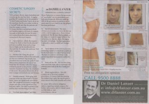
Many people flinch when they see some of the adverts I have written. That’s because they are all full of copy, lots of words, for people to read. People often tell me that “Nobody is going to read that much copy.”
I believe that nothing could be further from the truth. Only people who have no interest in the product or service you are promoting will dismiss what you have written without reading it. When people are interested in buying whatever it is you’re promoting they become what I call “ferrets for facts” and will soak up all the information they can find.
But of course the advert must get your attention and be interesting if it’s going to fan the flames of your desire.
This half page vertical advert in a metropolitan newspaper does that job wonderfully because, if the target market and women in particular are looking for cosmetic surgery, it will get their attention. They will probably read every word of it (or at least the parts dealing with the type of plastic surgery they are interested in). It will certainly provide enough information to generate enquiries.
However, whilst I love what Dr Lanzer has done I think there are some improvements that could be made. For instance:
A better headline – Remember that the headline is a vital piece of information that attracts the attention of the target market and convinces them that the rest of the advertisement is worth reading.
In this case the headline isn’t too bad but I think something like “Everything you ever wanted to know about cosmetic surgery” or “The secrets to a more beautiful you!” might have attracted more attention. The addition of a subhead like “Plastic surgeon answers all of your questions” would strengthen the attention-getting even more.
It would also be much better to use a serif font like Times Roman or Bookman in a much bigger point size to assist in attracting attention. Capitalising each word or using sentence case makes it much easier for people to read.
The surgeon’s photograph – Frankly I would have had the photograph at the top of the advertisement alongside the headline and captioned “Dr Daniel Lanzer, Plastic Surgeon” because it reinforces who is providing information. Having the photo in colour would add to it also.
Arrangement of photos – Although I love lots of copy I reckon that this advert becomes a tad boring because the photos are not arranged in and around the large amount of copy to which they refer. Breaking up the copy with photographs would make it far more interesting and attractive to the reader.
Breaking up the paragraphs – Rather than number each paragraph I would have used each of the paragraph headings and highlighted them in bold. It breaks up the sameness of all the copy and acts as subheadings (and many will merely scan the advertisement by reading the subheadings to get to the gist of the message).
Contact details – As I have pointed out on many occasions previously, I would not have those details reversed out in white (which means white print on a black background) because it is very much harder for people to read. Those details should be dark print on the white newspaper page.
But let me say these are only some suggestions for improving an advert that will probably work its backside off for Dr Lanzer. It’s good to see somebody giving great information for people who are ferrets for facts.
 If you want a comprehensive guide to making seminars work for you, purchase Winston’s great audio program How to run successful seminars – the Magic of Seminar Selling. Get great results for any business through Seminars and Workshops for both old & new clients. Whatever your business, you can use seminar magic to cultivate clients… and make heaps of sales too!


Recent Comments